Tips for Picking the Perfect Party Color Palette
Planning a party involves many elements, but one of the most crucial aspects is the color palette. The colors you choose set the tone and atmosphere, creating a cohesive and visually appealing experience for your guests. Whether you're planning a birthday bash, a wedding reception, or a holiday celebration, selecting the right color palette can elevate your event. Here are some tips to help you pick the perfect party color palette.
1. Consider the Occasion
The nature of your event plays a significant role in determining your color palette. For formal events like weddings, you might opt for classic and elegant color combinations such as white, gold, and blush. For a child's birthday party, vibrant and playful colors like bright pink, blue, and yellow can add a fun and energetic vibe. Seasonal events also offer natural color cues—think pastels for spring, warm tones for fall, and cool blues and silvers for winter.
2. Understand Color Psychology
Colors evoke emotions and set moods, so understanding color psychology can help you create the desired atmosphere for your party. For example:
Red is associated with excitement and energy, making it great for lively celebrations.
Blue is calming and serene, ideal for more relaxed gatherings.
Yellow is cheerful and can uplift spirits, perfect for daytime events.
Green symbolizes nature and tranquility, suitable for garden parties or eco-friendly themes.
Purple represents luxury and creativity, fitting for a sophisticated evening soiree.
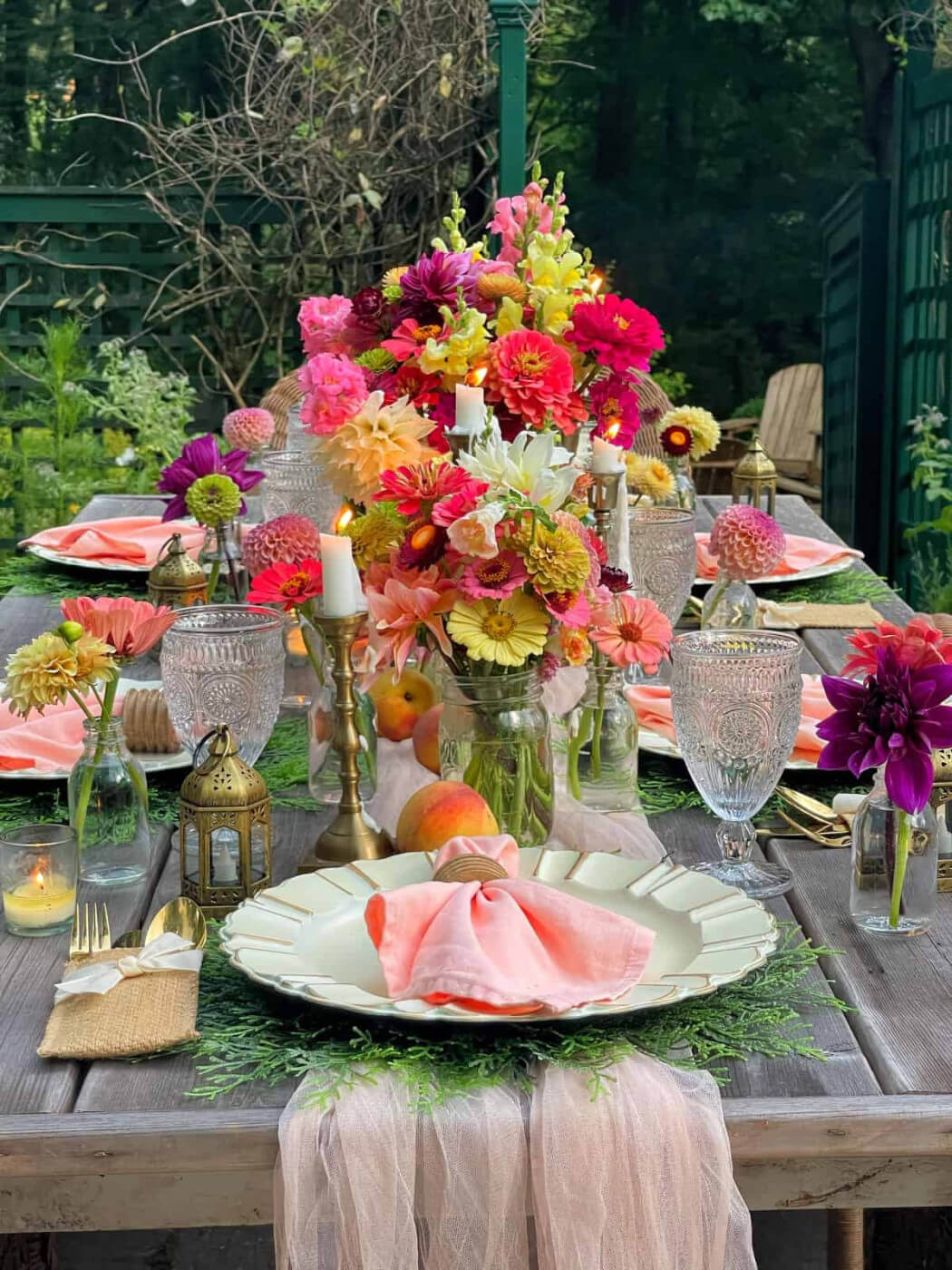
3. Get Inspired by the Venue
Your party venue can offer inspiration for your color palette. If you're hosting an outdoor event, take cues from the surrounding nature—lush greens, sky blues, and floral hues can complement the environment. For indoor venues, consider the existing decor and ambiance. A modern, minimalist space might look great with a monochromatic scheme, while a rustic barn could inspire earthy tones and warm, inviting colors.
4. Choose a Base Color and Build Around It
Start with one primary color that will serve as the foundation of your palette. This color should align with the event's theme and mood. Once you have your base color, select one or two complementary colors to create a balanced look. For instance, if your base color is navy blue, you could add accents of gold and cream for an elegant palette, or bright orange and white for a more dynamic combination.
5. Use the 60-30-10 Rule
A tried-and-true design principle, the 60-30-10 rule can help you create a harmonious color scheme. This rule suggests that 60% of the color palette should be the dominant color, 30% a secondary color, and 10% an accent color. This approach ensures a balanced and visually appealing look. For example, if you're using shades of blue, your dominant color could be a soft sky blue (60%), with navy as the secondary color (30%), and a pop of coral as the accent (10%).
6. Consider the Lighting
Lighting can dramatically affect how colors appear. Natural light enhances colors, making them appear more vibrant, while artificial lighting can alter hues and intensities. When choosing your color palette, consider the lighting at your venue. Test your colors in the same lighting conditions to ensure they look as expected. For evening events with dim lighting, opting for richer, deeper colors can create a more intimate and cozy atmosphere.
7. Think About Your Party Theme
If your party has a specific theme, your color palette should align with it. For a tropical luau, bright and bold colors like turquoise, coral, and lime green are perfect. For a vintage-inspired tea party, pastels and muted tones such as lavender, mint, and dusty rose would be more fitting. Aligning your colors with the theme ensures a cohesive look and enhances the overall experience for your guests.
8. Incorporate Trends Wisely
While it's tempting to follow the latest color trends, it's important to choose colors that you genuinely love and that will stand the test of time, especially for significant events like weddings. Trends can provide inspiration, but ensure your palette feels authentic to you. A classic color scheme with timeless appeal often makes a more lasting impression than a fleeting trend.
9. Balance Bold and Neutral Colors
A vibrant party color palette can be exciting, but it’s important to balance bold colors with neutrals to avoid overwhelming the senses. Neutral colors like white, beige, gray, and black provide a grounding effect and help bold colors pop without competing for attention. For example, pairing bright fuchsia with a neutral gray can create a stylish and balanced look.
10. Don’t Forget About Texture and Patterns
Incorporating different textures and patterns can add depth and interest to your color palette. Textured elements like metallics, velvets, and lace can enhance your chosen colors and bring your palette to life. Patterns such as stripes, polka dots, and florals can also add visual interest and tie your theme together. Just be mindful not to overdo it—select a few key textures and patterns to complement your colors without overwhelming the overall design.
11. Use Color Tools and Resources
There are numerous tools and resources available to help you choose the perfect color palette. Websites like Pinterest and Instagram provide endless inspiration, while online color palette generators can offer suggestions based on your preferences. Apps like Adobe Color and Canva can help you experiment with different combinations and visualize how they’ll look together.
12. Personalize Your Palette
Your color palette should reflect your personality and style. Don’t be afraid to infuse it with colors that have personal significance or that resonate with you on a deeper level. Whether it’s a favorite color, a hue that reminds you of a special place, or a combination that tells a story, personalizing your palette adds a unique touch to your event.
Conclusion
Choosing the perfect party color palette is a fun and creative process that sets the tone for your entire event. By considering the occasion, understanding color psychology, and drawing inspiration from your venue and theme, you can create a beautiful and cohesive look. Remember to balance bold and neutral colors, incorporate textures and patterns, and use color tools to experiment with different combinations. Most importantly, personalize your palette to reflect your unique style and make your event truly memorable. Happy planning!